Tuesday, September 29, 2015

Sneakers!

If you follow my blog, you know how much trouble I have making masculine cards, but I needed one.  I thought the sneaker die from MFT would make a cute card.  I searched Google for different style Chuck Taylor sneakers and when I found a pair with mustaches, I knew I had to use that idea for my sneaker card!  


The sneaker die is very detailed.  My favorite part is the tiny die that cuts out all of the eyelets.  They look fabulous cut out of gold or silver mirror card stock.  They aren't as difficult as you'd expect to glue on and they are well worth the effort because that little detail gives them the look of real sneakers...so cute!  I added a craft colored twine for shoe laces.
Guys like sports so I decided to put baseballs, footballs, basketballs and soccer balls inside since it went with my sentiment.  I used strips of acetate to attach them to a center spine so when the card is opened they bobble all around!


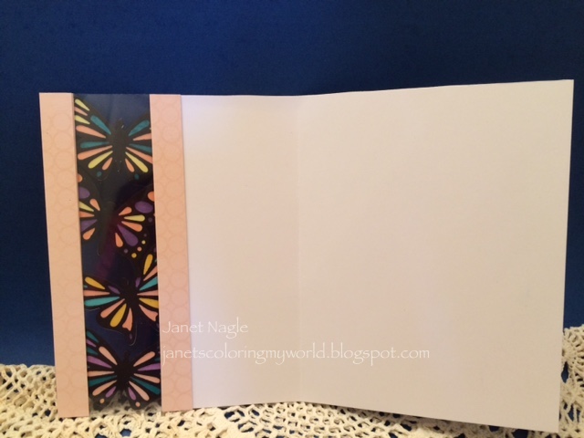
You can see the acetate strips a little better in this pic!


Thanks so much for visiting :)
Janet

Supplies Used:
Cardstock: Black, assorted DSP, gold mirror card stock
Stamps: none - sentiments were done on the computer
Dies: My Favorite Things LL All Star High Tops, Spellbinders Labels 17 
Miscellaneous: Acetate, twine, Stampin' Up Scalloped Oval & Large Oval 

Monday, September 28, 2015

Bouquet Greetings

I belong to a group called Random Acts of Mail.  The focus of this group is to send 2 cards a week to people in need.  It is nice to be a part of something that helps people to feel better when they need it most.  I like to make sets of cards so that I have them ready to mail out.  These cards were made for that purpose.  My inspiration was a card from Susan Kirk's Stamp Camp.  It's so simple yet pretty and is perfect to send when someone needs cheering up!  I like to do sets using different colors.  Here are how they came out...


I used Copics to color the flowers.  A light, medium and dark in each shade.  I colored the tulips in the lightest color, then added the medium and dark and blended the colors by going over it with the lightest color again.


Here are the Copics I used...


Thanks so much for taking time to look :)

Janet

Supplies Used:
Cardstock:  Stampin' Up Mossy Meadow & Old Olive, Papertrey  white, assorted complementary colors
Stamp: Stampin' Up: Love is Kindness & Endless Birthday Wishes
Copics: See above
Miscellaneous: Stampin' Up Scallop Oval & Large Oval Punch, Silver sequins


Saturday, September 26, 2015

12 Tags of 2015 - September

Tim's tag this month is beautiful.  I couldn't wait to make this one until I realized that the only things I had for making the tag were glossy paper and a handful of alcohol inks.  I decided to go with what I had and see if I could make it work.  Here is what I came up with...


Making the backgrounds was a blast! I didn't want to stop.  The technique is just like the one TH does with his Distress Stains, but the Alcohol Inks are much more vibrant and the addition of gold is really pretty.  You have to be careful not to smoosh too much because the colors blend to make mud quickly.  After making the background I stamped some butterflies.  I used an old Hero Arts butterfly stamp and then added clear embossing paste through a swirly Tim Holtz stencil.  I'm hoping you can see it in this photo.


I also didn't have the the frosted sheet that he used to make the 3D butterflies.  I used a piece of acetate and I really like the effect that I got when I heated it.  When it was hot it was very pliable and you could position it any way you wanted.  Once it was cool it would stay in that exact position.  Wow...very cool.  I'm going to have to think about ways to use this for other things.  It's hard to photograph.  I hope you can get an idea of how it looks here.


I used some strips from a green alcohol ink background to bring some more color to the bottom of my tag and added a TH number embellishment and a quote.  I died some seam binding ribbon with Peeled Paint Stain and Twisted Citron reinker to use at the top of my tag.  

This was a fun one and I learned a few new things! 

Thanks for visiting,
Janet

Friday, September 25, 2015

Butterfly Parade

This is the other card that I made for our Project Day.  I seem to be using these My Favorite Things dies more than any other.  They make beautiful, easy cards :)  I wanted a subtle pattern on the front so I used a stamp by MFT called Simply Circles to make a tone on tone background.


An acetate window added some interest but also caused a problem because you could see the backs of the butterflies on the inside of the card.  Cutting an additional black lacy butterfly for the reverse sides fixed the problem easily.  


I tried some other color combinations, and I like them but I wish I'd used a bigger sentiment stamp on these. 


Thanks so much for stopping by :)  Have a great weekend!

Janet


Supplies Used:
Card stock:  Stampin' Up Pink Pirouette, Black and White
Stamps: MFT Simply Circles & Assorted Sentiment Stamps
Ink: Versafine: Black and Versamark
Dies: MFT Flutter of Butterflies-Solid & Flutter of Butterflies-Lace
Miscellaneous: Copic markers, Acetate


Thursday, September 24, 2015

You Gnome Me - Hello Card

My group of stamping friends got together recently for a Project Day.  I am so lucky to know these girls. There is nothing better than a day of stamping and a lunch with people that you like!  I made 2 projects this time because I couldn't decide on just one.  For the first card I used the My Favorite Things set called You Gnome Me.  The card was inspired by one I found on Pinterest by Torico.  You can see her adorable card here.  All of the die cutting on this card is done with MFT's Blueprints 3, except for the fence and grass.  I don't have the dies to cut the gnomes so I cut him by hand.


I didn't have a soft yellow DSP, so I used a brighter one.  I had to use brighter colors for the background and the embellishments to make it look right.  I used Pan Pastels to make the sunset sky in the background. They are SOOO easy...I love using them to make backgrounds!  I also tried a new coloring technique for adding texture when coloring with Prismacolor Pencils.  You use a fine point stylus to press a pattern into the card stock and then when you color over it the pattern lines (dots) stay white!!  I found out that you can't use Gamsol for this technique because it makes the color bleed onto the white lines.  Here's a close up of the plaid pattern...


And here is how it looks with a dotted pattern!  Ohhh...ahhhh...imagine the possibilities!!


Thanks so much for visiting, hope I made you want to get out your stamps and play :)

Janet

Supplies Used:
Card stock:  Yellow Designer Patterned Paper, White Cougar Opaque 80 lb, Assorted solids
Stamps:  My Favorite Things: You Gnome Me
Dies: My Favorite Things: Die-namics  Blueprints 3, Fresh Cut Grass, Garden Fence
Miscellaneous: Prismacolor Pencils, Pan Pastels: Diarylide Yellow, Violet Tint, Ultramarine Blue

Tuesday, September 22, 2015

Bridal Shower Stamping Bella Card

Stamping Bella makes the girliest girl stamps ever.  I just love them so when it came time to make a shower card for my future daughter-in-law, Cathy, I had to use one for her card.  I used the Brigitte the Bride stamp from Stamping Bella.


Isn't she darling?  This card was a lot of fun to make.  I loved adding the embellishments and the bling!  Here's an angled view so you can see the sparkle better.


Here's a closer view.  I used Art Institute Sea Shell glitter over the top and bottom of her dress.  It's the most transparent clear glitter that I've found and the Copic coloring showed through just as I'd hoped it would!


I enjoyed making this card so much that I made another one in pink.  


I tried something new for adding color to the background.  Instead of using Copics, I used the Ultramarine Blue Tint Pan Pastel and a Sofft Tool knife.  I loaded up the knife, positioned it on the edge of the bride and pulled away.  It looks very much like a Copic shadow background but was so much easier to do!! 


Flower Soft really dressed up the bouquet...so pretty!  My friends convinced me to use it and I'm glad that they did.  I used pink and silver Flower Soft here.

Thanks so much for stopping by.  Have a nice day :)

Janet

Supplies Used:
Stamp: Brigitte the Bride from Stamping Bella
Cardstock: Papertrey White, Stampin' Up Basic Gray,  Bo Bunny yellow dot, Pink dot that I found at Joanne Fabrics, Stampin' Up Silver glitter card stock, vellum
Copics:  Skin: E00, E11, E50 and R02.  Dress: C00, C01, C02, C03  
Miscellaneous: Pink & Silver Flower Soft, Ultramarine Tint Pan Pastel, Sofft Tool knive, gems, Sizzix label dies, Paper piercer, Art Institute Sea Shell glitter

Friday, August 21, 2015

Life is Good

I made these cards for two delightful little ones who would like to get some mail!  Since they are brother and sister, I thought they might like getting cards with the same little crab on them.  When I want to make quick and simple cards my go to stamps are Lawn Fawn.  These were fun to make.  I can't wait to hear what Paulina and James think of them :)


Lawn Fawn dies are my favorite.  You stamp the image and then line up the inside edge of the die with the outside edge of the image...so easy, and then you cut and it's perfect, every time.  This set even has a die to cut out the sea gulls.  I didn't use them here but I cut out the tiniest one just to see if it would work and it came out perfect, too!  Amazing!!


I used Papertrey Ink Paper Basics - Stamper's Select White card stock for the pieces that I was stamping and coloring with Copics.  This card stock really helps the Copic ink to blend more easily.  It's the best one I've found.  

Thanks so much for stopping by.  Have a great weekend :)
Janet

Supplies Used:
Stamps: Lawn Fawn Life is Good
Cardstock:  80 lb. white Cougar Opaque, Papertrey Paper Basics-white, Stampin' Up DSP
Dies: Lawn Fawn Life is Good dies, MFT stitched rectangles, Stampin' Up Banners Framelits
Miscellaneous: Pan Pastels pthalo blue tint, ribbon, foam tape, 

Friday, July 17, 2015

Butterflies & Watercolor

This is the second project inspired by my friends.  This time it was Judy who helped me along!  She showed me a watercolor butterfly card that she'd made and I just loved it, especially the butterfly!  She used the new butterfly dies from MFT...Flutter of Butterflies.  There are two different sets that go together, one is solid and the other is lace.  What she'd done is cut a solid one in white and then a lace one in black...glued them together and used Copic Markers to color in the spots on the butterfly in different colors!  A simple idea with a big impact...and what's even better...you can make the butterflies match ANYTHING!!  I loved it and was really happy that I already had those dies!  Judy also covered the entire butterfly with Crystal Lacquer.  I loved that too, but had to get these card in the mail so I didn't have time to do that.  I had some watercolor backgrounds left over from the day I played so I cut those up to use with the butterflies.  It was fun to play with the colors and make them match!  Here is how they came out...


Here are close-ups!  When I was making the watercolor backgrounds, I wasn't sure if I liked the graininess of the paint but I really like the effect it gives on these cards


Thanks so much for visiting. hope you are having a good week!

Janet

Supplies Used:
Card stock:  Strathmore Watercolor paper, Cougar Opaque 80 lb, assorted colored card stock for matting and die cut words
Dies:  MFT Flutter of Butterflies - Solid & Lace, Lawn Fawn Hugs die, Lawn Fawn Thanks die, MFT Blueprints 13 and Blueprints 20, Stampin' Up small circle punch to cut corners of watercolor paper & mat
Paints:  Koi Watercolors set of 24
Miscellaneous: Assorted Twine

Tuesday, July 14, 2015

Lovin' the Penguins in Paradise Palm Tree!

I don't know if you are like me, but I am very influenced by my friends.  They buy something, I need it...they make something, I want to make it...they try a new technique, I want to try it!  Well that's been happening to me a lot lately and I ended up making cards because of them!!  First my friend, Tina, has been making and posting some REALLY cute dog cards.  Of course, this made me think of making a dog card.  I had a cute little dog stamp from a discontinued MFT set called Cupcake Cutie and I decided to use that stamp with the MFT Penguins in Paradise palm tree stamp that I LOVE!!  Here is how it came out...


Don't you love that palm tree???  It's so much fun to color and it isn't bad to cut out either.  There are dies to match the set if you don't like cutting, but I didn't want the white border so I cut it by hand. To frame out my scene I used MFT's Stitched Rectangles Frames.  I didn't add a sentiment yet because I'm not sure what I'm using this card for.  I'll add a Happy Birthday or Thinking of You later.  Here's an angled picture so you can see what's popped up.


The right side of the card looked bare so I added the little sand pail.  It's a die from Impression Obsession.  It comes in a set with sand castles, an ice cream cone and the pail & shovel.  Oh...almost forgot the sun, that's a Lawn Fawn die called Spring Showers.  I colored the sky with blue and purple Pan Pastel tints.


Thanks so much for stopping by!!

Janet

Supplies Used:
Card stock: Papertrey Ink white, Stampin' Up Confetti Kraft, Summer Sun and 
Bermuda Bay
Stamps: My Favorite Things - Penguins in Paradise and Cupcake Cutie (retired)
Copics:  Sand - E42, Water - BG13, Palm Tree Leaves - YG01, YG03, YG 17 & YG67, 
Palm Trunk - E59 & E87, Dog - W0, W03, W05, E42, E43, E44, B23 & E21,
Balloon - RV00, RV02, RV04 & RV06
Dies: MFT Stitched Rectangle Frames, Lawn Fawn Spring Showers, IO Mini Beach Fun Set
Miscellaneous:  Silver metallic Pilot marker, Pan Pastels - Pthalo Blue and Purple tints

Friday, June 19, 2015

Watercolor Background

I have had the hardest time making the beautiful watercolor backgrounds that I've been seeing on blogs an Pinterest lately!  They looked so simple but would turn into a muddy mess when I put brush to paper!  I searched on line and googled but I couldn't find anyplace that explained this in steps. Maybe it's too simple to bother explaining but I needed help!  Thanks to some help from my friend, Carolyn, I am doing much better. She took me through the steps and helped to make sense of it for me.  I even made a card that I'm not ashamed to post!


It seems, I was using too much paint, too much water and not giving the watercolors the patience necessary to let them do their thing!  Also...I wasn't taping the paper down to keep it flat which is a very important step!  I'll start at the beginning.  Here is the board I'm using to tape my watercolor to.  It is the thick cardboard backing from a pad of Strathmore watercolor paper.  I covered it with clear contact paper so the tape comes off easier once my pieces are dry.  


Once the watercolor paper is taped down nice and neat, you use your brush to lay down a water base.  Don't soak the paper, just coat it with water.  Have a paper towel nearby to blot your brush.  Next with some water in your brush, you pick up some color and touch it to the paper.  With the water from your brush and the water on the paper, the color should move...tipping the board this way and that will help.  Let it do it's thing.  


When you are happy with the first color, clean your brush and choose another color.  Keep repeating these steps until you have a colorful pleasing background and then LEAVE IT ALONE and let it dry. I did notice a graininess to the Koi paints as they dried, but I like the texture it adds.  The graininess is less pronounced if you use less paint.


Carolyn told me that if the paper feels cold to the touch it isn't completely dry.  When it is completely dry, it will lay nice and flat and will be ready to use on a card.  The nice thing about this type of backgrounds is that they make up into beautiful cards without a lot of fuss.  The watercolor is so striking that just a sentiment and a flower or butterfly finishes the card nicely


Once you get this to work, it's addictive and you want to make more, more, more!  Don't say I didn't warn you!  Thanks for stopping by.  Have a nice day :)

Janet

Supplies Used:
Cardstock:  Strathmore 300 Series cold press watercolor paper 140 lb, Stampin' Up DSP, Cougar Opaque 80 lb
Paints: Koi Watercolors set of 24
Dies:  Tim Holtz Thinlits: Friends & Celebrate sets, MFT Butterfly and Lacy Butterfly dies